Process
Showing my working for a short data story
I want to show my working for a short data story I finished recently. This is to give you an idea of my process and how I work. In general, I work through three main phases during a project:
- Understanding the audience and objectives.
- Preparation and research.
- Iterative development of the data visualisation.
Before getting into the details of my process, here is a bit of background about the data story itself. I’ve been thinking about (i.e. worrying about) the rapidly rising inflation rate in the UK. So, trying to direct some of that anxious energy in a productive direction, I worked on a little personal project. This put together a single chart explainer on the inflation picture in the UK, as things stand in August 2022.
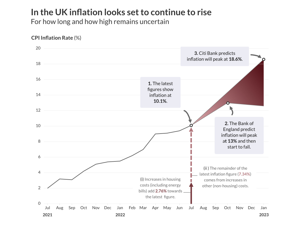
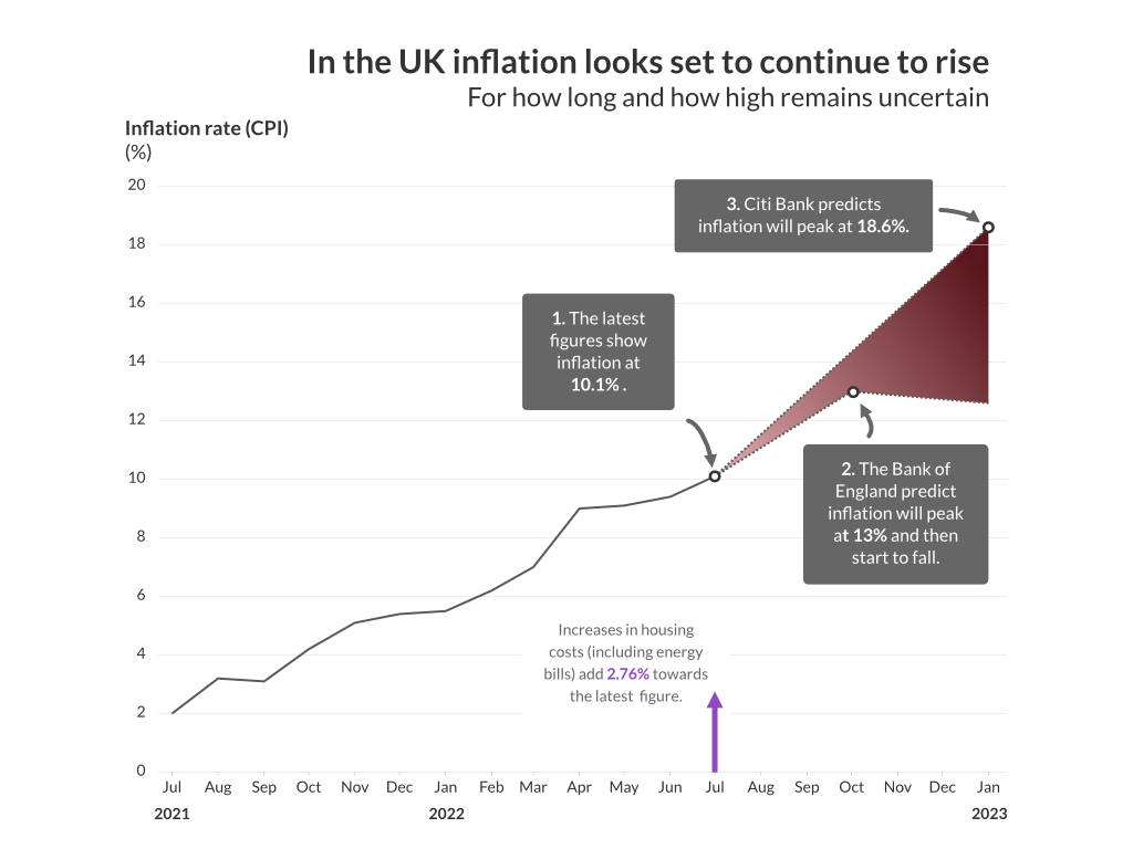
Sources: The Office for National Statistics; The Bank of England; Media reports on Citi Bank forecast;
Inflation in the UK has risen rapidly over the last year due to energy prices increases, and a combination of other domestic and global factors. The phrase ‘cost of living crisis’ has become synonymous with the reduction in living standards caused by high and rapidly rising inflation.
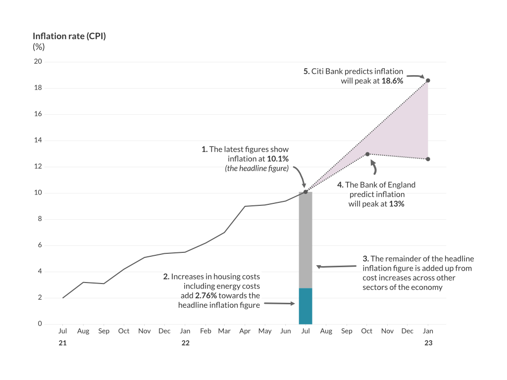
The latest figures show inflation at 10.1% in July 2022, see explanation note 1 on the chart. A year earlier (July 2021) inflation was just 2%. The Bank of England are responsible for controlling inflation. They forecast that inflation will peak at 13% during the Autumn of 2022, see explanation note 2. Other financial institutions are less optimistic. Citi Bank forecast that inflation will peak at 18.6% early in 2023, see explanation note 3.
Rising prices across many sectors of the economy are driving inflation. The rising housing costs - including rents and energy costs –are at the heart of many people’s experience of the ‘cost of living crisis’. They add 2.76% towards the latest inflation figure (10.1%), see explanation note (i). The remainder of the latest inflation figure (7.34%) comes from increases in other (non-housing costs) including food, transport, clothing, recreation etc. see explanation note (ii).
So, having introduced the chart, we can now get back to the details of how I created it.
Understanding the audience and objectives.
I like to start a project by thinking through who I am creating the chart for (i.e. the audience) and what I would like them to take away from it.
In this piece of work, I started with the relatively clear idea that I would create a single chart inflation explainer for a general audience. Someone with no training in economics. Someone who does not read the financial pages of the paper. Someone who is aware that prices are rising. Someone who is concerned about this. Someone interested in the understanding what is going with inflation. If I am honest, someone much like myself.
I wanted the reader of the chart to come away understanding high-level answers to three key questions.
- How quickly has inflation increased?
- How high might inflation go this Winter?
- Is inflation just coming from rising energy bills? Or, is it an issue more widely across the economy?
Preparation and research.
Data
Starting out with a clear sense of direction, I was able to keep my research and data gathering fairly focussed. The Office for National Statistics (ONS) provide some comprehensive inflation reports, and I was able to easily find the inflation data that I needed. Not only that, but I also found an ONS chart that addressed two of my three key questions: How quickly has inflation increased? And, is inflation just coming from rising energy bills?
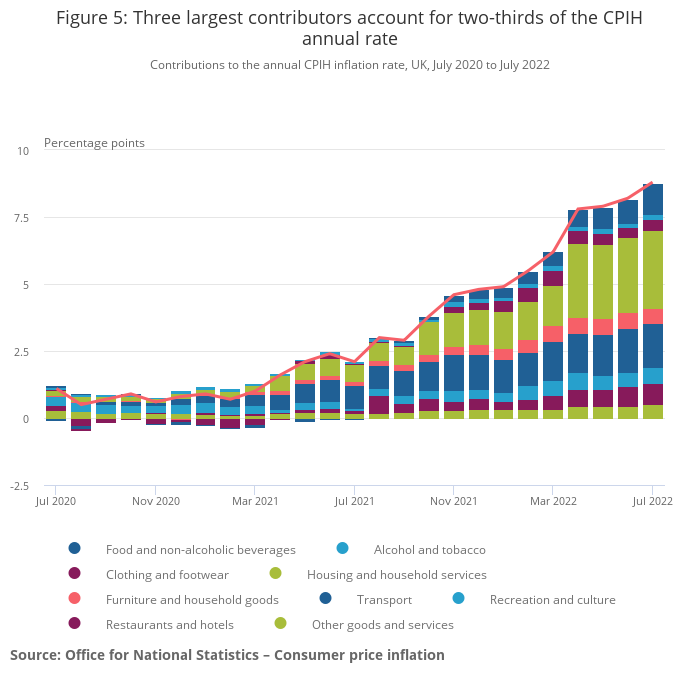
This ONS chart really shaped my thinking, about the chart I wanted to produce. I could see opportunities to simplify aspects of the ONS chart. For example, the number of economic sectors shown as contributing to inflation and the colour palette. I could also see opportunities to expand upon the ONS chart. For example, by adding annotations and inflation forecast data.
From here it was a case of filling in some gaps by identifying some credible inflation forecasts. This involved reading through Bank of England Monetary Policy reports (something I had never considered I would end up doing), and looking in the media for inflation forecasts from other institutions.
Design
The aesthetics and visual style of the chart I produced were informed and shaped by some visual research I had completed earlier in the year. I had produced a general moodboard for my data visualisation design work This is populated with many pieces of design that I find inspiring. I returned to this moodboard when creating my inflation chart. I picked out some key design ideas which I thought would work well for the topic and the audience. Design ideas which reflect the gravity of the topic (i.e. inflation) and widespread negative impacts across society. These included:
- A limited, and serious, colour palette.
- A minimal, and high contrast, aesthetic which allows the reader to focus on key story points in the chart.
- Extensive use of annotations to tell the story of the data.
- Simple and direct, sans-serif typography.
Iterative development of the data visualisation.
Equipped with the understanding of the audience and objectives, and the findings of my research, I developed and refined the chart and explanatory text over five iterations.
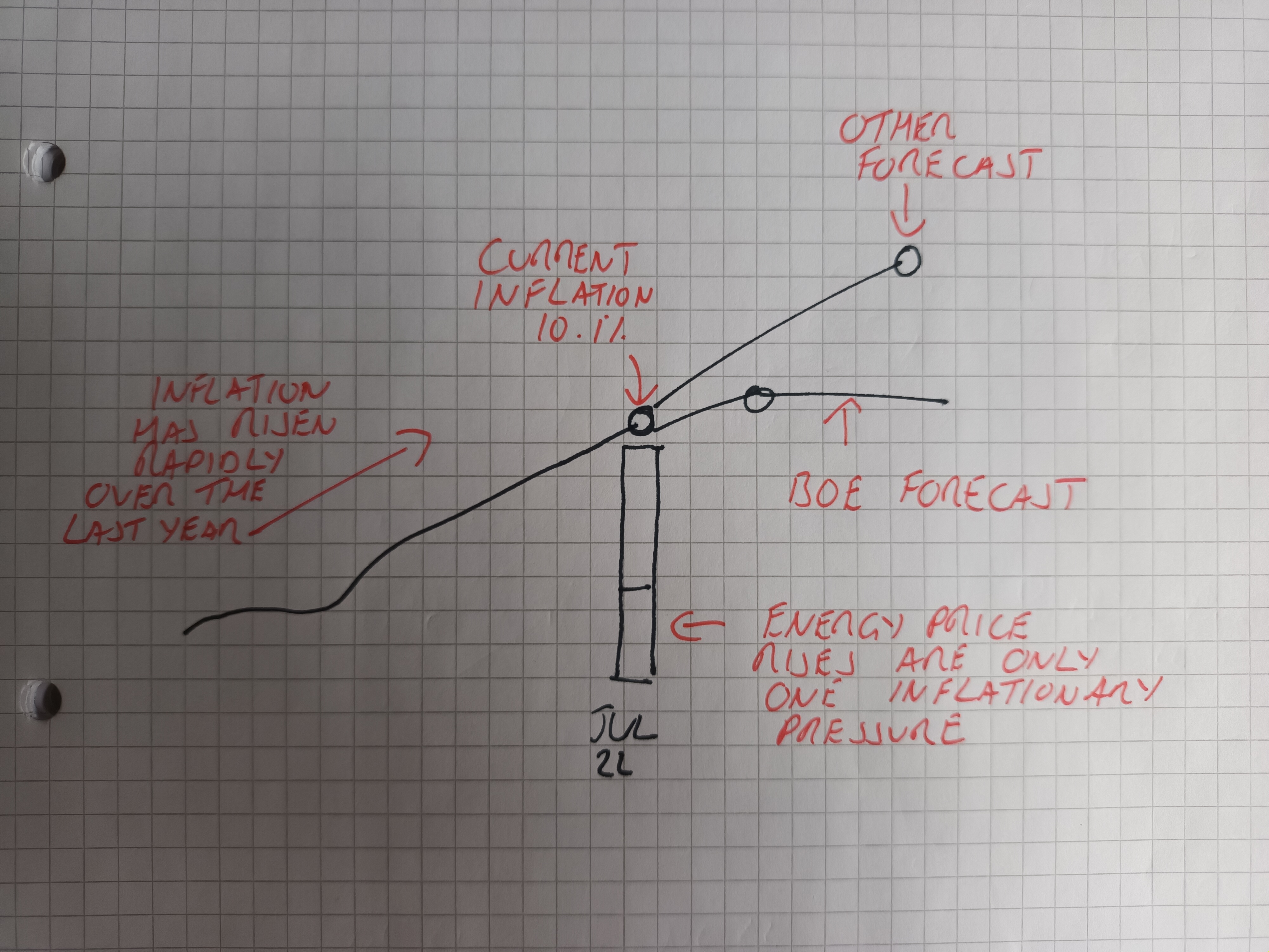
- Sketching various ideas for the skeleton of the chart on paper.
- Creating the basic un-styled chart without annotations using R and ggplot2. To create this some data cleaning and transformation was needed, I also used R (dplyr) to do this.
- Editing the un-styled chart to add the annotations and some key aesthetic enhancements (e.g. typography). I did this using graphic design software (Affinity Designer and Publisher).
- Refining the chart to improve the visual hierarchy of the annotations and simplifying the presentation of the contextual data (i.e. the contribution of housing costs to the current inflation rate).
- Finalising the chart by refining the colour palette and the presentation of the contextual data.
Through iterations 3 to 5 I shared draft versions of the chart with members of the Elevate Data Viz community and received some really helpful feedback. Also, throughout the process I was keeping track of ideas that occurred to me for other follow-on work. Idea and questions like:
- Does the Bank of England systematically underestimate inflation trends?
- How could I put together an interactive chart which allows people to compare inflation, at different dates, and across different sectors?
Finally, just to give a visual sense of how the chart developed, here are pictures of the chart at the end of each iteration.
Iteration 1
Iteration 2
Iteration 3
Iteration 4